Glucose & weight
How your meals affect your glucose
If your CGM is connected, Insights shows how your glucose behaved after the meals you ate. It is a look backwards at what happened, not a prediction of what will.
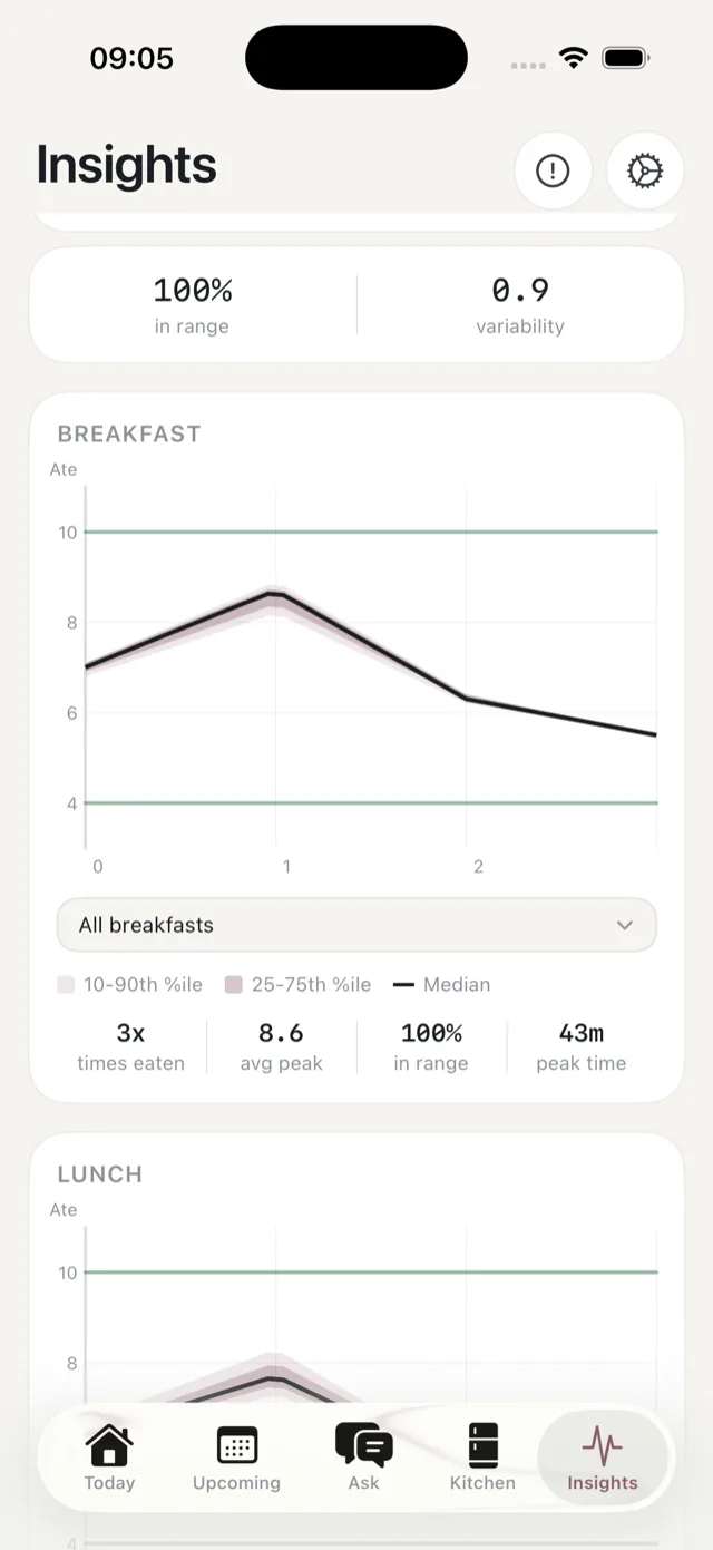
The charts
There is one chart per meal type, plus an option to look at a specific meal. Each plots the hours after eating, with:
- A median line, the middle of your readings.
- Two bands, the 25th to 75th percentile and the 10th to 90th, showing how much your readings varied.
- Two horizontal lines at 4 and 10 mmol/L, as a scale marker.
The lines at 4 and 10 are there to read the chart against. They are not a target band, and Bolus is not telling you to keep between them.
The figures underneath
- Times eaten — how many readings the chart is built from.
- Avg peak — the average highest value after the meal.
- In range — the share of readings between the two lines.
- Peak time — how long after eating the peak typically came.
Why a chart might be empty
Each chart needs meals you have both eaten and marked. Until you have eaten a few of a meal type, it says it is waiting on data rather than drawing a line through one reading.
It also needs your meal times to be roughly right, so readings line up with the correct meal. See cooking effort and meal times.
What this is not
It is not a prediction, a diagnosis or dosing guidance, and Bolus does not promise a glucose outcome from any meal. If something here concerns you, it is a good thing to take to your diabetes team, and Ask can put it into a summary for them. See a summary for your care team.